Content Types
Define and manage your content structure
Content types are the foundation of your content model. Every piece of content in the CMS, whether it’s a blog post, a team member, a product, or a property listing, belongs to a content type. The type defines the shape of the data: what fields it has, what those fields accept, and whether it supports block composition.
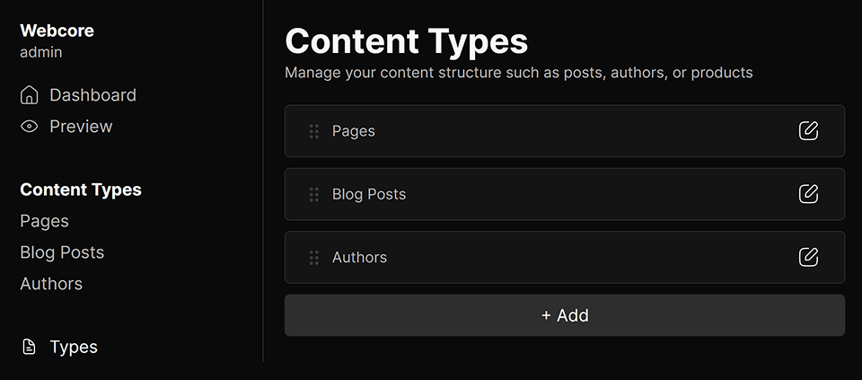
Content types are listed in the CMS sidebar and can be created, reordered, and deleted at any time. Each type you create is immediately available to editors as a new section in the sidebar.
Managing Types
Navigate to Content Types in the CMS to see all existing types. From here you can:
- Add a new type using the add button at the bottom of the list
- Reorder types by dragging them into your preferred position — this controls the order they appear in the sidebar
- Edit a type by clicking into it
- Delete a type from its options panel
Type Options
Each content type has the following options, editable from its sidebar panel:
- Type: A unique identifier for this content type, used internally and in your frontend code when querying entries. Must be lowercase and may only contain letters, numbers, and hyphens (e.g. blog-post, author, property). Cannot be changed on system types.
- Name: A human-readable label shown in the CMS sidebar and content lists.
- Description: An optional short description shown under the type name in the content type list.
- Supports Blocks: When enabled, content entries of this type can have blocks added to them via the block builder. Disabling this on an existing type will prevent further block editing but will not delete existing blocks.
Fields
Fields define the data shape of a content type. Each field you add appears as an editable control when creating or editing a content entry of that type. Fields can be reordered by dragging, and a live preview of the entry form is available while editing the type.
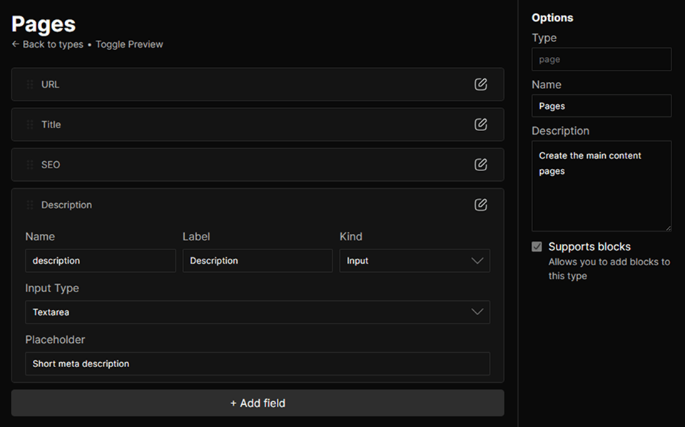
When a field is changed or deleted on a type that already has entries, the CMS will warn you of how many entries (and how many published entries) will be affected before applying the change. Every field has the following base options:
- Name: The internal key used to store the field value. Used to access the value in your frontend code via
entry.fields.name. Must be unique within the type. - Label: An optional human-readable label shown above the field in the entry editor. Falls back to the field name if not set.
- Kind: Determines what type of control the field renders in the entry editor. Can be one of:
input,separator, orblock.
Input
The input kind renders an editable control in the entry editor. The specific control is determined by the Input Type option:
- InputA standard single-line text field. You can specify a placeholder, Type (e.g. text, number, email, url). If the field is named "url", it'll additionally accept a Base URL used to generate preview links in the editor.
- TextareaA multi-line text input with configurable placeholder.
- CheckboxA boolean toggle with optional subtext shown beneath the label, and the option to be checked by default.
- SelectA dropdown with a configurable list of options (label + value) and an optional search bar.
Separator
The separator kind renders a visual divider in the entry editor. It stores no data and is purely organizational. Useful for grouping related fields within a long form.
Block
The block kind lets you associate a structured block with an entry field. When a field is set to block, you choose which block type it maps to from a searchable list of all available blocks in your project.
This is how relational-style data is modelled in the CMS. For example, to associate an author with a blog post, you would add a field of kind block and set its block type to Author. The entry editor will then let the editor configure the properties of the author and your frontend can resolve the full author data.
Using Content Types on the Frontend
Content types are queried on the frontend using the getContentType helper, which returns all entries of a given type along with their fields and blocks. It is designed to be used directly inside getStaticPaths in your Astro pages. You’ll find example usage in the pages folder.
import { type ContentTypeData, getContentType } from '@utils/server'

export type BlogFields = {    url: string    title: string    description: string    author?: Block<ReferenceProps>    image?: Block<ImageProps>}

export const getStaticPaths = () => getContentType<BlogFields>('blog', 'blog')
interface Props extends ContentTypeData<BlogFields> {}

const { id, // ID of the entry state, // "published", "draft", or "archived" stateName, // A human-readable label for the state entry, // The content entry's fields and options blocks // An array of blocks belonging to the entry. Can be passed directly to <ComponentMap /> to render them.} = Astro.propsurl for getContentType to generate routes for it. In production, the function additionally filters out entries that are not in a publicly visible state. - To get a full type safety on
entry.fieldsthroughout your page component, type the field shape and pass it as a generic togetContentType. - The helper expects a content type identifier and a route parameter name (if not set, it’ll default to
route). The route parameter must match the name of your Astro file’s dynamic segment (e.g. in the example above[...blog].astrowould require a route parameter namedblog). - Each entry is returned with its typed
fields, itsblocksin order, and its currentstateandstateName, which you can use to display draft or preview indicators on the frontend.
Permissions
Access to content types is governed by the following permissions, assignable per role:
| Permission | Description |
|---|---|
types:read | Required to view the content types list and open individual types. |
types:create | Required to create new content types. |
types:update | Required to edit type options and add, edit, reorder, or delete fields. |
types:delete | Required to delete a content type and all its entries. |