This template extends the free product page template by incorporating advanced features designed to improve user experience and drive conversions. The added functionalities provide customization options and professional UI elements tailored to meet various business needs.
Easy to Setup
---import ProductPage from '@templates/ProductPage.astro'
const layout = {    seo: { ... } // Your SEO configuration    menu: { ... } // Menu configuration    footer: { ... } // Footer configuration}---
<ProductPage    layout={layout}    images={[ ... ]} {/* Your Carousel images */}    carousel={{ ... }} {/* Optional Carousel configuration */}    buttons={[ ... ]} {/* CTA buttons */}    features={[ ... ]} {/* List of features under CTA */}    recommended={{ ... }} {/* Recommended items */}
{/* Additions to the free product page template: */} breadcrumbs={{ ... }} {/* Breadcrumb configuration */} faq={{ ... }} {/* FAQs */} reviewSection={{ ... }} {/* Customer reviews */} showStickyCta={true} stickyCta={{ ... }} {/* Sticky CTA configuration */} price="$7.99" pricePeriod="/month" pricingInfo={ text: 'This product supports purchasing power parity...', theme: 'info' }> <span>Your main content</span></ProductPage>---import ProductPage from '@templates/ProductPage.astro'
// Your layout with SEO, including menu and footerconst layout = { seo: { title: 'Product Page Template - WebcoreUI', url: 'https://webcoreui.dev/', description: 'A customizable and easy to use template for products.', faviconUrl: '/logo.svg' }, menu: { logo: { html: logo }, items: [ { name: 'Templates', href: '/templates' } ] }, footer: { logo: { html: logo }, columns: [ { title: 'Sitemap', items: [ { href: '/', name: 'Home' } ] } ], subText: `© ${new Date().getFullYear()} WebcoreUI. All Rights Reserved.` }}
// Your carousel imagesconst images = [{ src: '/img/product.webp', alt: 'Product image', width: 1200, height: 250}]
// Additional carousel configurations, such as paginationconst carousel = { pagination: { type: 'dots' }}
// List of recommended products after the main contentconst recommended = { items: [{ href: '/recommendation', img: { src: '/img/recommended-product.webp', alt: 'Product image', width: 500, height: 250 }, name: 'Recommended Card', price: '$19', showFavoriteButton: true, button: { text: 'Preview' }, badge: { icon: checkWavesIcon, text: 'Top rated' }, rating: { score: 5, color: 'var(--w-color-warning)' } }]}
// CTA buttons shown under pricingconst buttons = [ { text: 'Get Started ->', theme: 'success', href: '/register' }, { text: 'Demo', theme: 'secondary', href: '/demo' }]
// List of features under the CTA buttonsconst features = [ 'Create breadcrumbs', 'Add a sticky CTA', 'Provide FAQs below your main content', 'Display pricing details'].map(feature => ({ icon: circleCheck, color: 'var(--w-color-success)', text: feature}))
// Breadcrumbs right below your menuconst breadcrumbs = { items: [ { icon: 'home', href: '/' }, { label: 'Templates', href: '/templates' }, { label: 'Product Page' } ]}
// Product pricing information above CTA buttonsconst price = '$7.99'const pricePeriod = '/month'const pricingInfo = { text: 'This product supports purchasing power parity...', theme: 'info'}
// FAQ listed under the main contentconst faq = { title: 'FAQ', icon: 'plus', reverse: true, items: [{ title: 'Create FAQs', content: 'Use the <code>faq</code> prop to define FAQs under your main content.' }]}
// Your review section with reviews and summaryconst reviewSection = { reviews: [{ name: 'Jonathan Doe', date: '2025. 02. 15.', description: 'Absolutely fantastic product!', rating: { score: 5, color: 'var(--w-color-warning)', emptyColor: 'var(--w-color-primary-30)', outline: false }, avatar: { img: '/img/avatar.png', alt: 'Avatar' }, ratedFor: 'Rated for <b>Product Quality</b>', positives: [ 'Excellent build quality', 'Fast shipping', 'Great customer service' ], negatives: [ 'None' ] }], summary: { subText: 'Based on {0} reviews', description: 'Help users make informed decisions.', rating: { color: 'var(--w-color-warning)', emptyColor: 'var(--w-color-primary-30)', outline: false }, colors: [ 'var(--w-color-alert)', 'var(--w-color-alert)', 'var(--w-color-warning)', 'var(--w-color-success)', 'var(--w-color-success)' ], cta: { text: 'Write a review' } }, reviewButtons: [{ icon: replyIcon, text: 'Reply', theme: 'flat' }, { icon: flagIcon, text: 'Report', theme: 'flat' }, { icon: likeIcon, text: 'Helpful', theme: 'flat' }], reviewCountTitle: 'Showing {0} reviews', verifiedText: 'Verified review'}
// Sticky CTA configuration that enters the viewport after the main CTA leaves itconst showStickyCta = trueconst stickyCta = { text: 'Customizable and easy to setup template for your products'}---
<ProductPage layout={layout} images={images} carousel={carousel} buttons={buttons} features={features} recommended={recommended} breadcrumbs={breadcrumbs} price={price} pricePeriod={pricePeriod} pricingInfo={pricingInfo} faq={faq} reviewSection={reviewSection} showStickyCta={showStickyCta} stickyCta={stickyCta}/>type ProductPageProps = { layout: LayoutProps images?: { src: string alt: string width: number height: number lazy?: boolean }[] carousel?: Omit<CarouselProps, 'items'> buttons?: ({ text: string icon?: IconProps['type'] | string } & ButtonProps)[] features?: IconListProps['items'] recommended?: { title?: string items: ProductCardProps[] } breadcrumbs?: BreadcrumbProps price?: string pricePeriod?: string pricingInfo?: { text: string } & AlertProps faq?: FAQProps reviewSection?: { title?: string } & ReviewsProps showStickyCta?: boolean stickyCta?: { text: string cta?: ({ text: string icon?: IconProps['type'] | string } & ButtonProps) } & Omit<StickyCtaProps, 'showBefore' | 'showAfter' | 'showAfterEnter' | 'cta' > [key: string]: any}Key Features
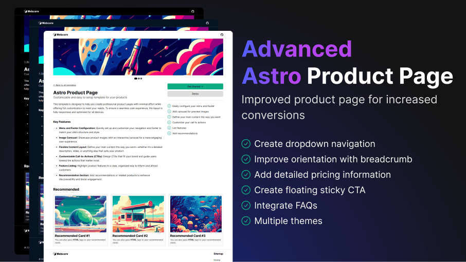
- Dropdown Navigation: Organize your content with customizable dropdown menus, allowing users to easily navigate between sections or related products.
- Breadcrumb Support: Enhance site navigation using the
Breadcrumbcomponent that include support for icons and custom separators, improving user orientation and SEO. - Pricing Information: Clearly display pricing details, including price, billing period, and additional pricing notes, to help customers make informed decisions.
- Floating Sticky CTA: Boost engagement with a floating call-to-action (CTA) feature that includes customizable buttons, text, and images, ensuring your key messages stay visible as users scroll.
- Integrated FAQs: Address common customer questions with an FAQ section that supports animations, various layouts, and icon customization for a visually appealing and informative experience.
- Summarize user reviews: Provide summary of user feedbacks with rating and sentiment, helping potential customers quickly grasp overall satisfaction and common insights.
Documentation
We've collected the following documentations for you that can help you get the most out of this template:

Try the free version of this template that also supports the following features:
| Feature | Free |
|---|---|
| Multiple themes | |
| Easily configure menu and footer | |
| Add image carousel | |
| Customize your call to actions | |
| List features in sidebar | |
| Add recommendations | |
| Define content with any HTML/component | |
| Support | Community |