Changelog
Latest changes for WebcoreUI
Here you can find a summary for all of our changes made for WebcoreUI in chronological order.
-
v1.5.0
Introducing accessibility and DX improvements, improved type checking and autocomplete for several components, and reactive props for Svelte variants!
What’s new?
- 🎨 Improved accessibility of themes 386166e
- 🎨 Improved accessibility of outline buttons and badges 2c4327f
- ✨ Made Svelte component props reactive a62cc53 , d9bf8c2
- ✨ Added
CarouselItemforCarousel57ce4c8 - ✨ Added
Tabcomponent improvements 6494d32 , 51e365b - ✨ Added flat variant to
Cardcomponent cf2a655 - ✨ Added HTML support to
Cardtitle 22b4e17 - ✨ min/max is now optional for
Slider9189c41
What has changed?
- 🏷️ Moved framework-specific types to components fb763eb , 7bbc151
- 🏷️ Replaced any types with generics 6711c86
- 🏷️ Replaced deprecated event types d147f1f
- ⚡️ Improved CSS bundle size bf13af0
- 💄 Improved visual hierarchy of themed modals 349d96e
- 💄 Reduced CSS footprint of
Card22c60d9 - 💄 Fixed overflow on cards 0ab3537
- 💄 Increased line-height of modal
subTitleto improve readability 0bddfc4 - 🐛 Added safety checks to
List241af34 - 🐛 Added safety check to
SpeedDialff91841 - 🐛 Added missing required attributes to inputs 0ffac49
Block changes
- ✨ Added
destroymethod touseFormhook, and submit-button management e0be595 - ✨ Added
reset&clearmethods touseForme6a2d6e - ✨ Improved
SettingCardconfigurability e942759 - ♻️ Replaced images in blocks with
Imagecomponent ea0e8a1 - 🏷️ Simplified avatar type for
Authorblock b217038 - 🏷️ Improved types of
getInputand flexibility ofupdateforuseForm6149b0d - 💄 Fixed
ExpandableTablebutton alignment in flex containers df044be - 💄 Fixed
Useralignment in flex containers 082d782 - 💄 Fixed
GridWithIconsSVG size to 24px 2a3c9fc - 🐛 Fixed import for
SignUp6812d27 - 🐛 Fixed import in
ExpandableTable1793202 - 🐛 Prevent invalid URL errors for
Socials6111a63
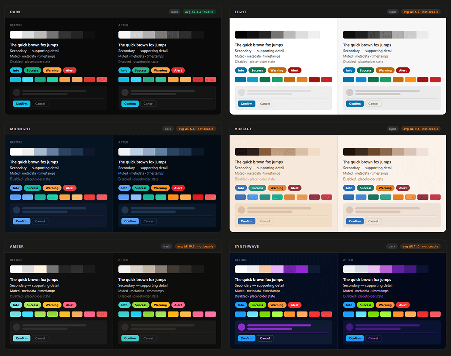
Color contrast has been increased for all themes while staying as close to original colors as possible. Before and after:
-
v1.4.0
Introducing the
ImageandImageLoadercomponents, smarter popovers, usability and TypeScript improvements, along with several bugfixes.What’s new?
- ✨ Added
ImageandImageLoadercomponents 349f43d , bd29062 - ✨ Added ability to set
Accordionitems to expanded by default 26b0fd9 - ✨ Added
onChangeevent handlers toCheckboxandSwitchf9e6b47 - ✨ Added
onInputsupport toTextareacomponent 1fbe57e - ✨ Popovers now have collision detection d79f5f6
- ✨ Popovers now can be closed by instance 6cbb005
- ✨ Popover instances now can be destroyed using
instance.destroy()bfb1208 - ✨ Added subtext and badge support for
Tiles4c8bb45 - ✨ Reviews are now toggleable on
Portfoliotemplate 63c5c8c
What has changed?
- 🏷️
getDOM utility function is now a generic bd29062 - 🏷️ Allow
Modaltrigger to be optional a1b116c - 💄 Prevent user selection for
SwitchandThemeSwitcher9335c9e - 💄 Center-align
Tilesagainst multiline text c0261ef - ♻️ Cleaned up
Herocomponent ea2348b , 11cc7d3 - ♻️ Simplified
Buttonblocks 20134ff - 🐛 Fixed
RangeSlidermax button in wrong position 02b99de - 🐛 Fixed
DataTableerrors on filter with empty table data 0dd6f21 - 🐛 Fixed
DataTablesorting breaking with special chars in headings af2914a - 🐛
Popoverinstances are now removed from DOM when callinginstance.remove()b433502 - 🐛 Fixed improper import for
Emptyblock 4327172 - ♻️
Maintenanceblock minor refactor to improve consistency 8acda42
Use the
Imagecomponent to render images with consistent visual styles:
- ✨ Added
-
v1.3.0
Introducing the
Countercomponent, indeterminate progress bars, transparent badges and popovers, and a handful of CSS fixes.What’s new?
- ✨ Added
Countercomponent 9f7c44c - ✨ Added indeterminate
Progressbars 15e7952 - ✨ Added transparent badges b048048
- ✨ Added transparent popovers 97e426a
- ✨ Added
secondarytheme toList475e409 - ✨ Added
Emptyblock 4d663b1 , d3dfeef
What has changed?
- 🐛 Added missing
nametoRangeSlider96763bc - 💄 Prevent text selection for
Pagination77064dc - 💄 Fix search input padding without icons for Svelte lists 4e5a353
Use the
Countercomponent to allow your users to select a range of values: - ✨ Added
-
v1.2.0
Introducing the
RangeSlidercomponent, along with new features for existing components, accessibility improvements and bugfixes.What’s new?
- ✨ Added
RangeSlidercomponent 1a65cd3 , 4c05079 , 8e9787d - ✨ Added responsive
itemsPerSlideoption toCarousel50e26b5 - ✨ Added multimodal support to
Modalcomponent 99f2dcd - ✨ Added
AvatarWithRatingblock f534eef - ✨ Added
AvatarWithRatingtoHeroe0df038 - ✨ Added
useSmartFilloption touseFormhook d499bc3 - ✨ Added
getBreakpointutility function 50e26b5 - ✨ New
includeBreakpointsoption is available in thesetupmixin. 50e26b5
What has changed?
- ♿️ Improved keyboard accessibility of
OTPInputbeebe51 - ♻️ Improvements to TypeScript types 3d5e10c
- 🐛 Fixed a bug where calling
bodyFreezecaused layout shifts whenmax-widthis set onbody1a97674
Use the
RangeSlidercomponent to allow your users to select a range of values: - ✨ Added
-
v1.1.0
Introducing the
webcoreintegration to improve setup time and package manager support, along with a couple of smaller bugfixes and improvements to existing components.What’s new?
- ⬆️ Updated Astro to the latest version (v5.13) e9bf66
- ✨ Added
ContextMenucomponent 44db1e - ✨ Added
webcoreintegration a19d93 - ✨ The
Switchcomponent now supports HTML formatting for toggle labels da3632 - ✨ Added
FormandExpandableTableblocks 53fc60 , 22eb1d , 353268 - ✨ Added
Authenticationtemplate 9baadb
What has changed?
- ⬆️ Updated
Carouselto Svelte 5 syntax e562a0 - 💄 Fixed rendering issue of bolded fonts 95eb4b , a5b284
Update yourastro.config.mjsfile to use the new integration:import { webcore } from 'webcoreui/integration'export default defineConfig({integrations: [webcore()]vite: {ssr: {noExternal: ['webcoreui']}}}) -
v1.0.0
Introducing our first stable release! After a year of development, we reached a stage where we consider the library stable. Moving forward, we’ll follow semantic versioning to release new changes. No breaking change should be expected at this point for the existing components and blocks.
What’s new?
- ⬆️ Updated Astro to the latest version (v5.5) bb399f8
- ✨ Added
SpeedDialcomponent a1c3624 - ✨ Added
OTPInputcomponent 6271661 - ✨ Added
MaintenanceandTeamblocks d47cc17 , d7bd5af - ✨ Added
Blogtemplate 8e4ac28 - 💄 Refined existing and added new themes 37fb50b
Use the
OTPInputcomponent to display a one-time password input.•What has changed?
-
v0.10.1
-
v0.10.0
Introducing templates, along with Svelte 5 and React 19 updates. In this release, we focused on making our existing components more accessible, usable, and fixed several bugs. We made several accessibility improvements that you can find below.
What’s new?
- ⬆️ Updated React to the latest version (v19.0)
- ⬆️ Updated Svelte component to new Svelte 5 syntax da0a362
- ✨ Added
LayoutandSEOblocks 8b50b54 - ✨ Added Portfolio and Product Page templates 22d826a , d437b74
- ✨ Improved
Iconcomponent cf433af , e59664d - ✨
ListandSelectcomponents now support case-insensitive search bab4b30
What has changed?
- ♿️ Improved components accessibility 3bf2f15
- ♿️ Scrolling is now prevented when a modal or sheet is active 05354a4
- 💄 Arrow icons are now called chevrons e59664d
- 🐛 Fixed Svelte
Copycomponent bec3f67 - 🐛 Interactive components are now compatible with Astro’s ViewTransition API 090fedf
Not that
arrowDown,arrowLeft, andarrowRighticons have been renamed to chevrons. If you use these icons imported fromwebcoreui/iconsor through theIconcomponent, you’ll need to update your references:Update arrow icons to chevrons // Update importsimport { arrowDown, arrowLeft, arrowRight } from 'webcoreui/icons'import { chevronwDown, chevronwLeft, chevronwRight } from 'webcoreui/icons'// Update types<Icon type="arrow-down" /><Icon type="chevron-down" />The
fileandcomponentsicon types have also been removed. Use theiconSetprop instead to add additional custom icons when using theIconcomponent. -
v0.9.0
Introducing Astro 5.0 update with four new components:
BottomNavigation,Copy,Flex, andGrid, two new blocks calledDeviceMockupandGridWithIcons, along with several other improvements!What’s new?
- ✨ Added
BottomNavigationcomponent c129bcb - ✨ Added
Copycomponent d2b91efClick to copy - ✨ Added
Flexcomponent 6db7706 , f35250b , aac5d1e - ✨ Added
Gridcomponent 75acad4 - ✨ Added
DeviceMockupblock 89a8d81 - ✨ Added
GridWithIconsblock 956e8a1 - 💄 Added responsive utility classes 8f75064
- 🏷️ Additional component types now available for import c746064
Use the BottomNavigation component to provide quick access to primary navigation items <BottomNavigationitems={[{ name: 'Home', icon: 'home', href: '#' }, { ... }, { ... }]}separated={true}floating={true}/>You can now import the following types: import {DataTableEventType,HeadingObject,ListEventType,PaginationEventType,SelectEventType} from 'webcoreui/astro' // Also available from webcoreui/svelte and webcoreui/reactWhat has changed?
- ⬆️ Updated Astro and Svelte to 5.0 ed15e0a , 1f101e1
- ✨
Selectcomponents can now infer their value from theiritemGroupsprop f0b57f3 - ✨ Added HTML support for input labels b71f2e3 , 78a6b0a
- ✨ Added two-way data binding for Svelte
Inputcomponents 78a6b0a - ✨ Added ability to pass data attributes to input elements d35c82b
- 💄 Improved default styles of cards and muted text ac7cb7f
- 💄 Improved
Skeletonresponsiveness 59ea089 - ♿️ Improved accessibility of
SelectandPopover4e64b50 - 🐛 Fixed Svelte badges always rendering as button elements 1754ccb
- 🐛 Fixed icon size shrinking for
Accordionwith multiline text 13abb69 - 🐛 Fixed type error when using
getwith a single parameter 8e94c6b
We also updated our dependency to Astro 5.x, meaning you can safely remove the following config from your codebase in case they’re present:
You can remove the following config from astro.config.mjs export default defineConfig({vite: {ssr: {noExternal: ['webcoreui']}css: {preprocessorOptions: {scss: {api: 'modern-compiler'}}}},experimental: {directRenderScript: true // Enabled by default in Astro 5.x}}) - ✨ Added
-
v0.8.1
Introducing two new components:
SkeletonandRibbon! We also updated Sass to the latest version which includes some breaking changes. Please read the “What has changed” section below to see the migration guide.What’s new?
What has changed?
- 🐛 Fixed React warning with
Tablecomponent b2d8aca - 🐛 Fixed TypeScript warnings for
ConditionalWrapperwhen extra props are used b415d12 - 🐛 Fixed a bug where icons on
Buttoncomponents prevented click events b415d12 - ⬆️ Updated Sass to latest version (v1.77 -> v1.80) 516d2ad
Breaking change: We updated Sass to the latest version, which means we no longer support the legacy@importrule. Please make the following changes in your WebcoreUI project.1. Update your Sass version in your package.json "sass": "1.77.5","sass": "1.80.7",2. Update your CSS configs to use the new @use rule @import 'webcoreui/styles';@import 'webcoreui/config';@use 'webcoreui/styles' as *;@use 'webcoreui/config' as *;3. Update your astro.config.mjs file with the following settings export default defineConfig({vite: {ssr: {noExternal: ['webcoreui']}css: {preprocessorOptions: {scss: {api: 'modern-compiler'}}}}}) - 🐛 Fixed React warning with
-
v0.7.0
Introducing 5 new components, bringing the total number of Astro, Svelte, and React components to over 40! We also made some improvements to our
Accordioncomponent, and updated Astro to the latest version (v4.15 -> v4.16), without any breaking changes.What’s new?
- ✨ Added
Steppercomponent 4c98734 , 06bd895 - ✨ Added
Kbdcomponent 2e75831 : ⌘⇧K - ✨ Added
Bannercomponent b6cc705 - ✨ Added
AspectRatiocomponent e42ec8c , 5cb1648 - ✨ Added
Spoilercomponent d698776 , 5cb1648 : Click to revealthe text behind
Use the Stepper component to guide users through a series of steps <Stepper items={[ { title: 'Setup' }, { title: 'Configure' } ... ]} />-
SetupGet ready
-
ConfigurePreferences
- 3 FinishFinal steps
What has changed?
- ✨ Added
-
v0.6.1
In this small release, we added multiple items per slide support for the
Carouselcomponent, added two new DOM utility function (getandon), and improved types and CSS utility classes:- ✨ Added multiple items per slide support for
Carousela12f0bc - ✨ Added DOM utility functions for Astro 4739898
- 🏷️ Updated types and CSS utilities d9f08a5 , 4d960fd
You can now use the following utility functions in Astro import { get, on } from 'webcoreui'const element = get('.selector') // Get a single DOM elementconst element = get('.selectors', true) // Get all DOM elements with the selector// Adding event listeneron('button', 'click', () => console.log('Button clicked.')) - ✨ Added multiple items per slide support for
-
v0.6.0
Introducing 4 new components, along with more customization options for existing components, including an option to turn any element into a modal!
What’s new?
- ✨ Added
Breadcrumbcomponent 3b23622 - ✨ Added
Masonrycomponent a677653 , 3aa028c - ✨ Added
Sidebarcomponent 495ce1e , 49d8ef4 - ✨ Added
Footercomponent acf1121 - ✨ Added transparent modal for opening custom components 45a573b
- ✨ Added small and rounded badges 4638ed1 , 1fdef66 rounded small small rounded
- 🏷️ Improved types 2cee766 , 3b1b54b , f7c2c0f , d7ccb77
- 🏷️ Export component prop types 24aebdb
Breadcrumb component example: What has changed?
- 🧑💻 Unify
Menulink url naming withFootercomponent f9e98e7
If you’re using menus, please rename the
urlproperty tohref:<Menu items={[{ name: 'Home', url: '/' }]} /><Menu items={[{ name: 'Home', href: '/' }]} /> - ✨ Added
-
v0.5.0
Introducing 3 new components:
Pagination,DataTable, andCarousel, along with several bug fixes!What’s new?
- ✨ Added
Paginationcomponent 13cf23c , 60eeddd , a837f8b - ✨ Added
DataTablecomponent 5ca8180 , bd84616 , ec044f1 , 0e79854 - ✨ Added
Carouselcomponent c40747b , f2cb11d , c3e491f , a3cc89e - ✨ Added table for CSS resets ff69141
- ✨ Allow
Selectcomponents to keep their original values e40bb35 - ⚡️ Remove resize observer from
Selectcomponents on unmount 755be14 - 💄 Add option to target Avatar groups with CSS classes d990a55
Disable automatic value update to use Select as command list or combobox <Selectvalue="Take an action"itemGroups={[ ... ]}updateValue={false}/>What has changed?
- 💄 Reduce
<code>tags paddings e807579 - 🐛 Fixed labeled inputs not taking up the full width of their containers cdefdec
- 🐛 Fixed pagination buttons not disabled when prop set 5712336
- 🐛 Fixed errors when multiple paginate listen events are present on the same page 5712336
- 🐛 Fixed
ListsubTextalignment for links without icons 0e9b6a3
- ✨ Added
-
v0.4.0
Introducing 3 new components, including a highly customizable
Selectinput! With this release, WebcoreUI now has over 30 fully coded components for Astro, Svelte, and React!What’s new?
- ✨ Added
Selectcomponent 7c84dcb - ✨ Added
Listcomponent 4f5b3c3 - ✨ Added
Groupcomponent 2e7cc32 , cc2b9bd - ✨ Added ability to select card body through props dc94487
- ✨ Added ability to disable animations 94b84e5 , 3be1540
- ✨ Added
onInputsupport forInputcomponents 7d7a6e2
webcore.config.scss // Set the following in your CSS configuration file if you need to completely disable animations$disableAnimations: trueWhat has changed?
- 🏷️ Improved types for existing components
- ✨ Improved Modal API 5ec3df6 . See the updated documentation for more info.
- 🐛 Fixed resize issues with elements when placed inside
.grid1923fd5 - 🐛 Prevent Popover to take up visible space when toggled off 79014e1
For
Modals, you can now pass a configuration to yourmodalutility function to specify the trigger element using thetriggerproperty:button.addEventListener('click', () => modal('#my-modal'))modal({trigger: '#my-button',modal: '#my-modal'})In Svelte and React, you can keep on passing the selector of the modal only, instead of using a configuration object:
<Button onClick={() => modal('#my-modal')}>Open Modal</Button> - ✨ Added
-
v0.3.0
Introducing 4 new component, including
Popover(with 12 different possible positions),Sheet(with all 4 positions),CollapsibleandTextarea!What’s new?
Show changesCollapse changes What has changed?
-
v0.2.0
Introducing sliders and modals! With this release, we also made several improvements to our existing components.
What’s new?
- ✨ Added
Slidercomponent 39f9bf8 , 98e95e7 - ✨ Added
Modalcomponent 633d4f7 , c9f8f1f - ✨ Added utility classes for flexbox 9143a5c
- ✨ Added interpolate utility functions
Use the Slider component to adjust values within a specified range <Slider value={30} />What has changed?
- ✨ Added support for scrollable tables e93f276
- ✨ Added additional theme example 7de1a37
- ✨ Made
Ratingcomponent accept decimal numbers e6b8beb - ✨ Accept active state for menu items 58c00e2
- ♿️ Improved components accessibility e72a8ed
- 💄 Match default font size with browser defaults 6658c96
- 💄 Adjust alert alignments 77c088f
- 🐛 Fixed React types for
TimelineItem64d9d3d - 🐛 Fixed tooltip and timeline alignment issues 6a386ef
The
includeHelperClassesCSS configuration option has been renamed toincludeUtilities, and we added additional CSS utility classes for flexbox. Please check the layout documentation for more information on how to use these.If you don't want utility classes enabled, replace the rule @include setup((includeHelperClasses: falseincludeUtilities: false)); - ✨ Added
-
v0.1.0
With this release, we reached a milestone for WebcoreUI! Moving forward, we’ll use minor versioning until we reach a stable
v1.0, after which we continue version updates using semantic versioning.What’s new?
- ✨ Added support for CSS customization 84cd405
- ✨ Added base CSS mixins
Breaking change: Moving forward, you’ll need to add awebcore.config.scssfile at the root of your project directory.This will add the ability to better customize the CSS of WebcoreUI. See our CSS configuration docs for more info on how to customize your CSS. You can now also use our custom mixins to stay in line with WebcoreUI’s theme when building your own custom components.
What has changed?
- 💄 The
includeElementStylesoption has been removed from thesetupmixin, and instead, element styles are added using theincludeResetsoption.
If you don't want element styles enabled, replace the rule with includeResets @include setup((includeElementStyles: falseincludeResets: false)); -
v0.0.12
Introducing themes along with a custom
ThemeSwitchercomponent! As part of this release, we also made smaller bug fixes, improved our component’s accessibility, and introduced CSS modules for proper scoping.What’s new?
- ✨ Added
ThemeSwitchercomponent dbf4eb6 - ✨ Added
Menucomponent 8a60322 - ✨ Added themes 499dbd4
- ✨ Added styles for scrollbar 1b6fc71
- ✨ Icons are now importable as strings 98a35b8
- 💄 Added new CSS utility classes
You can now import SVG icons as strings from webcoreui/icons import { info } from 'webcoreui/icons'What has changed?
- ✨ Improved components usability, simplified logic, and fixed visual bugs 1c05443
- The
Badge,Button, andCheckboxcomponents can now accept custom classes through theclassNamesprop.
- The
- 🏷️ Made Svelte component types importable 347800b
- ♿️ Improved accessibility of components b826d00
- 🐛 Fixed improper imports causing errors when using the
Inputcomponent df2a7b8 - 🐛 Fixed a bug with the
Ratingcomponent when scores are not set - 🐛 Fixed a tooltip bug where content overlaps with other elements on the page
- 💄 Introduced CSS modules to prevent style collisions 02a9199
The
fillprop has been removed from theInputcomponent. To achieve the same style, set thethemeprop tofillinstead:The
boxedprop of theCheckboxcomponent has also been removed. Instead, wrap your checkbox into aCardcomponent if you’d like to achieve the same visuals: - ✨ Added
-
v0.0.11
Introducing tables and inputs! With this release, WebcoreUI now comes with a total of 20 components for Astro, Svelte, and React that you can use in your projects!
-
v0.0.10
Introducing our biggest release yet! This release includes 6 new components and many improvements to type definitions, usability, and bug fixes!
What’s new?
- ✨ Added
Progresscomponent 1ff8653 - ✨ Added
Timelinecomponent f2a146e - ✨ Added
Toastcomponent fec229d , 1d3eaaf , 9f116fd - ✨ Added
Tooltipcomponent cb0ca27 . Hover me to see example. - ✨ Added
Spinnercomponent 31f334e - ✨ Added
Tabscomponent dc0d1dd , a269841 , f55bf83
Use the Progress component to represent the completion status of a task or process <Progress value={30} />What has changed?
- ✨ Allow
Badgecomponent to accept HTML attributes e52c1f9 - 🏷️ Make React type definitions importable 6505075
- 🏷️ Fixed type errors for React callback function arguments 689d430
- 🐛 Fixed React component bugs dcd1645
We’ll soon move forward with minor version updates once all core components are in place and our Sass configuration reaches a more stable state.
- ✨ Added
-
v0.0.9
Introduction the following 5 new components to WebcoreUI!
What’s new?
-
v0.0.8
- 💄 Improvements to CSS scoping
-
v0.0.7
- ✨ Added
AlertandConditionalWrappercomponents 6c16a19 - ✨ Added
Badgecomponent 6fe0780 - ✨ Added Svelte + React card components 1098d75
What has changed?
Introducing additional core components to WebcoreUIAlertfor displaying important message,Badgefor labels and status indicators, andConditionalWrapperfor improved code quality. This block was created using an infoAlert.We also introduced Svelte and React variants for the
Cardcomponent, added TypeScript types for ourIconcomponent, and removed dynamic imports to prevent flashes on page load + made improvements to scope CSS. - ✨ Added
-
v0.0.6
-
v0.0.5
What has changed?
- 💄 Improved Accordion usability 4b0be79
- 💄
includeFontsremoved in favor offontRegularandfontBoldconfiguration rules c710311
Remove includeFonts and replace with fontRegular and fontBold @include setup((includeFonts: true// Define paths for your fontsfontRegular: '/fonts/Inter-Regular.woff2',fontBold: '/fonts/Inter-Bold.woff2'));This release includes minor changes to the existing components to improve usability, with improvements to the way CSS works in WebcoreUI that aims to improve developer experience and configurability.
-
v0.0.3
Introducing our first public release of WebcoreUI, including the following core components and changes:
- ✨ Added
Accordioncomponent - ✨ Added
Buttoncomponent - ✨ Added
Cardcomponent for Astro - 💄 Initial setup for CSS configuration, including the addition of
TransitionandMediamixins. - 💄 Introduced the following SCSS configuration options:
includeResets: Configuration rule to include CSS resets.includeFonts: Configuration rule to include font-specific rules.includeHelperClasses: Configuration rule to include utility classes.
- ✨ Added
Request improvement for this page