This template combines the ProductDetails and Reviews components to create a visually compelling, content-rich page for your products. See the free product page template for a simpler layout.
Easy to Setup
---import ProductDetailsPage from '@templates/ProductDetailsPage.astro'
const layout = {    seo: { ... } // Your SEO configuration    menu: { ... } // Menu configuration    footer: { ... } // Footer configuration}---
<ProductDetailsPage layout={layout} reviewSection={{ ... }} {/* Customer reviews */} breadcrumbs={{ ... }} {/* Breadcrumb configuration */} recommended={{ ... }} {/* Recommended items */} details={{ ... }} {/* ProductDetails props */} stickyCta={{ ... }} {/* Sticky CTA configuration */} showStickyCta={true}> <span>Your main content</span></ProductDetailsPage>---import ProductDetailsPage from '@templates/ProductDetailsPage.astro'
// Your layout with SEO, including menu and footerconst layout = { seo: { title: 'Product Page Template - WebcoreUI', url: 'https://webcoreui.dev/', description: 'A customizable and easy to use template for products.', faviconUrl: '/logo.svg' }, menu: { logo: { html: logo }, items: [ { name: 'Templates', href: '/templates' } ] }, footer: { logo: { html: logo }, columns: [ { title: 'Sitemap', items: [ { href: '/', name: 'Home' } ] } ], subText: `© ${new Date().getFullYear()} WebcoreUI. All Rights Reserved.` }}
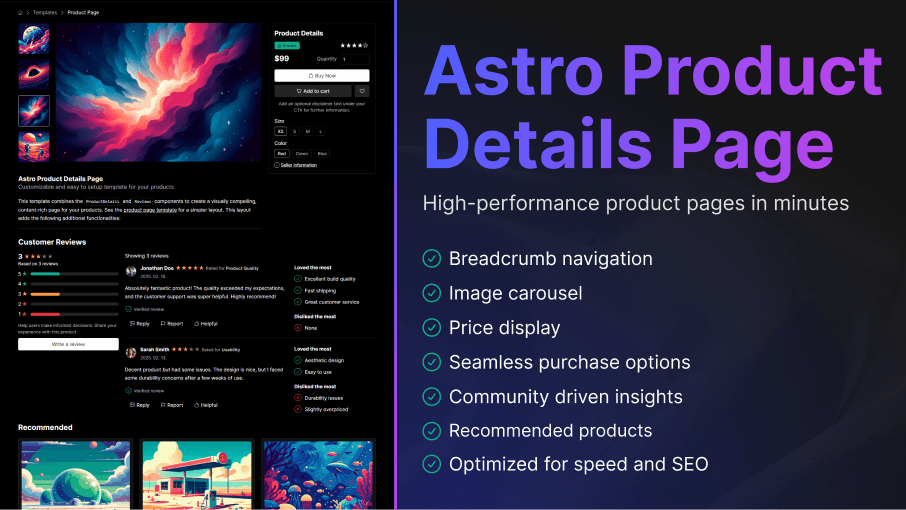
// Breadcrumbs right below your menuconst breadcrumbs = { items: [ { icon: 'home', href: '/' }, { label: 'Templates', href: '/templates' }, { label: 'Product Page' } ]}
// Your main product details, including gallery, pricing and optionsconst details = { images: [{ src: '/img/product-image.png', alt: 'Preview', width: 250, height: 450 }], title: 'Product Details', badge: { text: 'In stock', theme: 'success', icon: 'home' }, rating: { score: 4 }, price: '$99', disclaimer: 'Add an optional disclaimer text under your CTA.', options: [{ name: 'Size', values: ['XS', 'S', 'M', 'L'] }, { name: 'Color', values: ['Red', 'Green', 'Blue'] }], seller: { href: '/seller-link' }}
// Your review section with reviews and summaryconst reviewSection = { reviews: [{ name: 'Jonathan Doe', date: '2025. 02. 15.', description: 'Absolutely fantastic product!', rating: { score: 5, color: 'var(--w-color-warning)', emptyColor: 'var(--w-color-primary-30)', outline: false }, avatar: { img: '/img/avatar1.png' }, ratedFor: 'Rated for <b>Product Quality</b>', positives: [ 'Excellent build quality', 'Fast shipping', 'Great customer service' ], negatives: [ 'None' ] }], summary: { subText: 'Based on {0} reviews', description: 'Help users make informed decisions.', rating: { color: 'var(--w-color-warning)', emptyColor: 'var(--w-color-primary-30)', outline: false }, colors: [ 'var(--w-color-alert)', 'var(--w-color-alert)', 'var(--w-color-warning)', 'var(--w-color-success)', 'var(--w-color-success)' ], cta: { text: 'Write a review' } }, reviewButtons: [{ icon: replyIcon, text: 'Reply', theme: 'flat' }, { icon: flagIcon, text: 'Report', theme: 'flat' }, { icon: likeIcon, text: 'Helpful', theme: 'flat' }], reviewCountTitle: 'Showing {0} reviews', verifiedText: 'Verified review'}
// List of recommended products after the main contentconst recommended = { items: [{ href: '/recommendation', img: { src: '/img/product.png', alt: 'Recommended product', width: 500, height: 250 }, name: 'Recommended Card', price: '$19', showFavoriteButton: true, button: { text: 'Preview' }, badge: { icon: checkWavesIcon, text: 'Top rated' }, rating: { score: 5, color: 'var(--w-color-warning)' } }]}
// Sticky CTA configuration that enters the viewport after the main CTA leaves itconst showStickyCta = trueconst stickyCta = { text: 'Customizable and easy to setup template for your products'}---
<ProductDetailsPage layout={layout} breadcrumbs={breadcrumbs} details={details} reviewSection={reviewSection} recommended={recommended} showStickyCta={showStickyCta} stickyCta={stickyCta}/>type ProductDetailsPageProps = { layout: LayoutProps breadcrumbs?: BreadcrumbProps details: ProductDetailsProps reviewSection?: { title?: string } & ReviewsProps recommended?: { title?: string items: ProductCardProps[] } showStickyCta?: boolean stickyCta?: { text: string cta?: ({ text: string icon?: IconProps['type'] | string } & ButtonProps) } & Omit<StickyCtaProps, 'showBefore' | 'showAfter' | 'showAfterEnter' | 'cta' > [key: string]: any}Key Features
- Breadcrumbs: Easily create breadcrumbs for clear navigation using the
breadcrumbsprop that accepts aBreadcrumbcomponent configuration. - StickyCTA: Configure a sticky CTA that appears after the first CTA leaves the viewport. It gets automatically configured with data from the page, but you can also use the
stickyCtaprop to configure it yourself. - Pricing: Provide pricing and pricing details to your user using the
ProductDetailscomponent. - Reviews: Showcase and summarize customer reviews and testimonies to help users make the right purchasing decisions.
- Recommendations: Add a list of recommended products at the end of your page using the
recommendedprop.
Inside the template, you’re free to add any HTML or component.
Documentation
We've collected the following documentations for you that can help you get the most out of this template:

Try the free version of this template that also supports the following features:
| Feature | Free |
|---|---|
| Multiple themes | |
| Easily configure menu and footer | |
| Image carousel | |
| Customize your call to actions | |
| Add recommendations | |
| Define content with any HTML/component | |
| Support | Community |