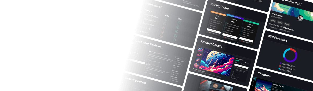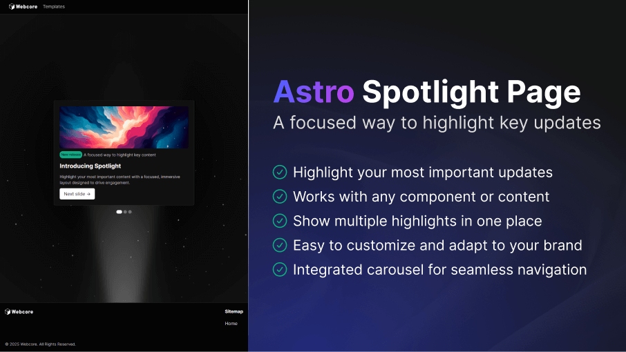
Create focused, high-impact highlight sections that guide users toward your most important updates, announcements, or releases. The Spotlight template makes it simple to showcase content in a visually engaging and flexible way. Perfect for product pages, dashboards, or marketing surfaces.
Easy to Setup
---import Spotlight from '@templates/Spotlight.astro'
const layout = {    seo: { ... } // Your SEO configuration    menu: { ... } // Menu configuration    footer: { ... } // Footer configuration}---
<Spotlight layout={layout} carousel={{ items: 3 }}> <li data-slide="1">1st slide content</li> <li data-slide="2">2nd slide content</li> <li data-slide="3">3rd slide content</li></Spotlight>---import Spotlight from '@templates/Spotlight.astro'
// Your layout with SEO, including menu and footerconst layout = { seo: { title: 'Spotlight Page Template - WebcoreUI', url: 'https://webcoreui.dev/', description: 'A customizable template for highlighting important updates.', faviconUrl: '/logo.svg' }, menu: { logo: { html: logo }, items: [ { name: 'Templates', href: '/templates' } ] }, footer: { logo: { html: logo }, columns: [ { title: 'Sitemap', items: [ { href: '/', name: 'Home' } ] } ], subText: `© ${new Date().getFullYear()} WebcoreUI. All Rights Reserved.` }}
// Your carousel configuration that must include the number of slides set for `items`const carousel = { items: 3}---
<Spotlight layout={layout} carousel={carousel}> <li data-slide="1">1st slide content</li> <li data-slide="2">2nd slide content</li> <li data-slide="3">3rd slide content</li></Spotlight>type SpotlightProps = { layout: LayoutProps carousel: CarouselProps spotlight?: SpotlightComponentProps}Key Features
- Highlight what matters most: Present key updates or announcements in a clean, immersive layout designed to draw attention and increase engagement.
- Compatible with any component or content type: Drop in cards, media, or fully custom sections. The template adapts to whatever you need to showcase.
- Showcase multiple messages effortlessly: Display several highlights in one unified space, ideal for product tours, feature spotlights, or sequential announcements.
- Customizable to match your brand: Adjust colors, typography, spacing, and layout patterns to create a cohesive branded experience.
- Built-in carousel for smooth navigation: Guide users through multiple highlights with a seamless, integrated carousel that works out of the box.
Documentation
We've collected the following documentations for you that can help you get the most out of this template: